T.Carcel Events

Objective
To guide the user through an experience where they can imagine how a potential event can be through images, videos, and price packages. The site will feel welcoming and trustworthy, with a color palette that will connect with users that are getting married or hosting company events.
Timeframe: Thirteen days
Deliverables: Research, information architecture, interaction design, low/high fidelity wireframes, usability testing, and user interface design
Software: Sketch, Invision, Illustrator, Photoshop, Optimal Survey

ROLES
UX Designer: prototyped experiences at low and high fidelity through concept sketches, wireframes, and high fidelity interactive prototypes.
UX Researcher: conducted field observations, contextual inquires, interviews, and usability tests with targeted users.
Client-Facing Communication: research findings and designs through considerate slide deck designs. Discussed with peers to define success parameters and share resources/ideas.
RESEARCH
Methodology
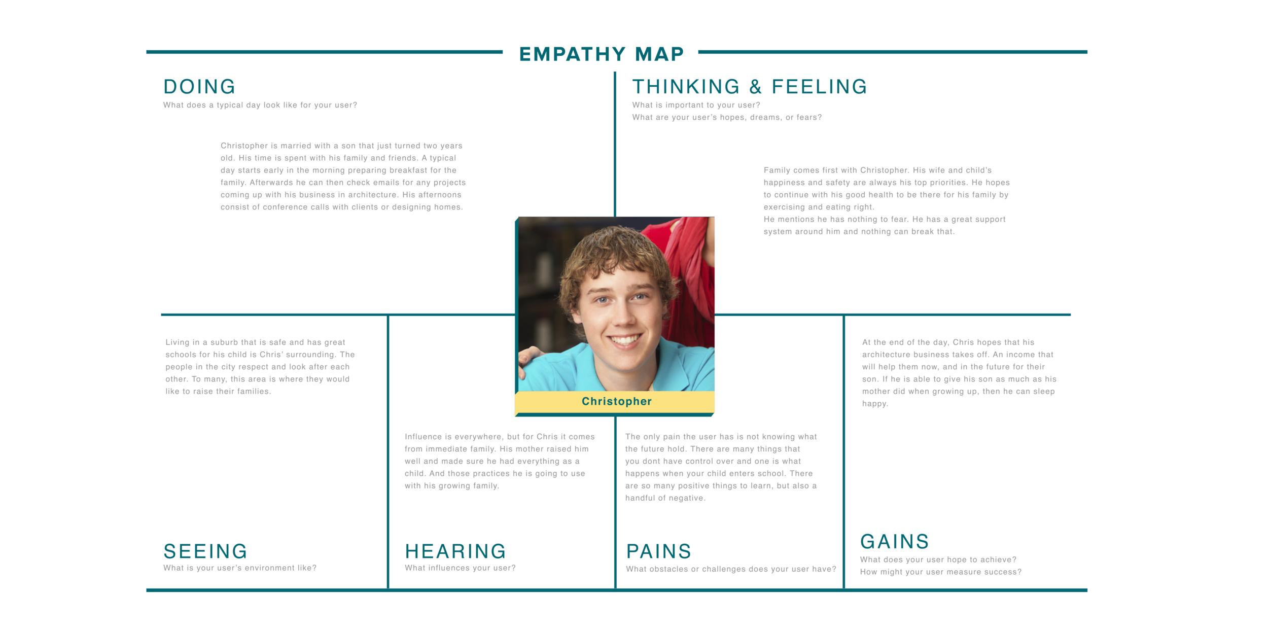
1:1 Research: Interview both genders to get a better grasp of what is needed and expected. Questions will focus on experiences with planning events.
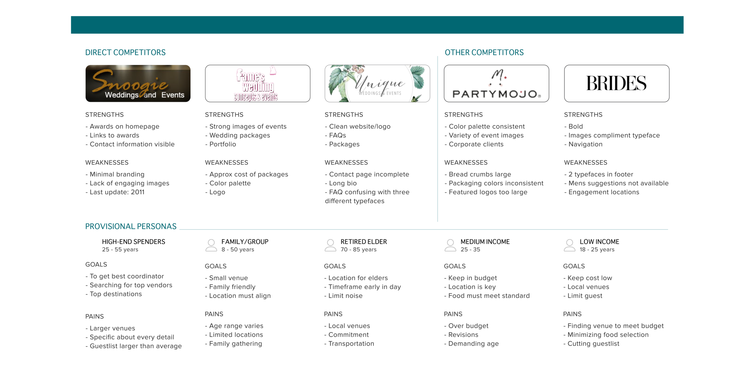
Competitive Analysis: Review other event planning and wedding sites. What are the most common features that lure potential clients in? What isn’t working for each of these sites and how can they be improved?
Findings
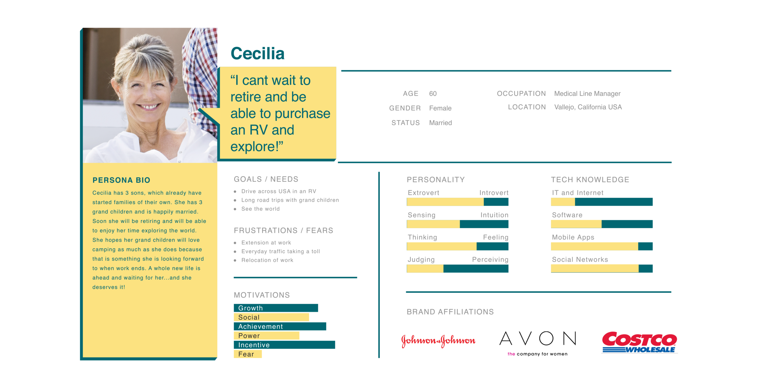
I interviewed a number of people regarding their experiences with event planners. The age range was a factor because each had different purposes to contact or use a planner. Ages 25-35 contacted an event planner only for weddings. The age range from 50-65, used an event planner for birthdays or corporate events. Each age range gave me useful information on what they expected from an event website.
INFORMATION ARCHITECTURE
Creating goals and conducting a survey will help me understand what the user needs to have the best experience planning an event. The information gathered will also assist in mapping out what the user will encounter while exploring the site.


Findings
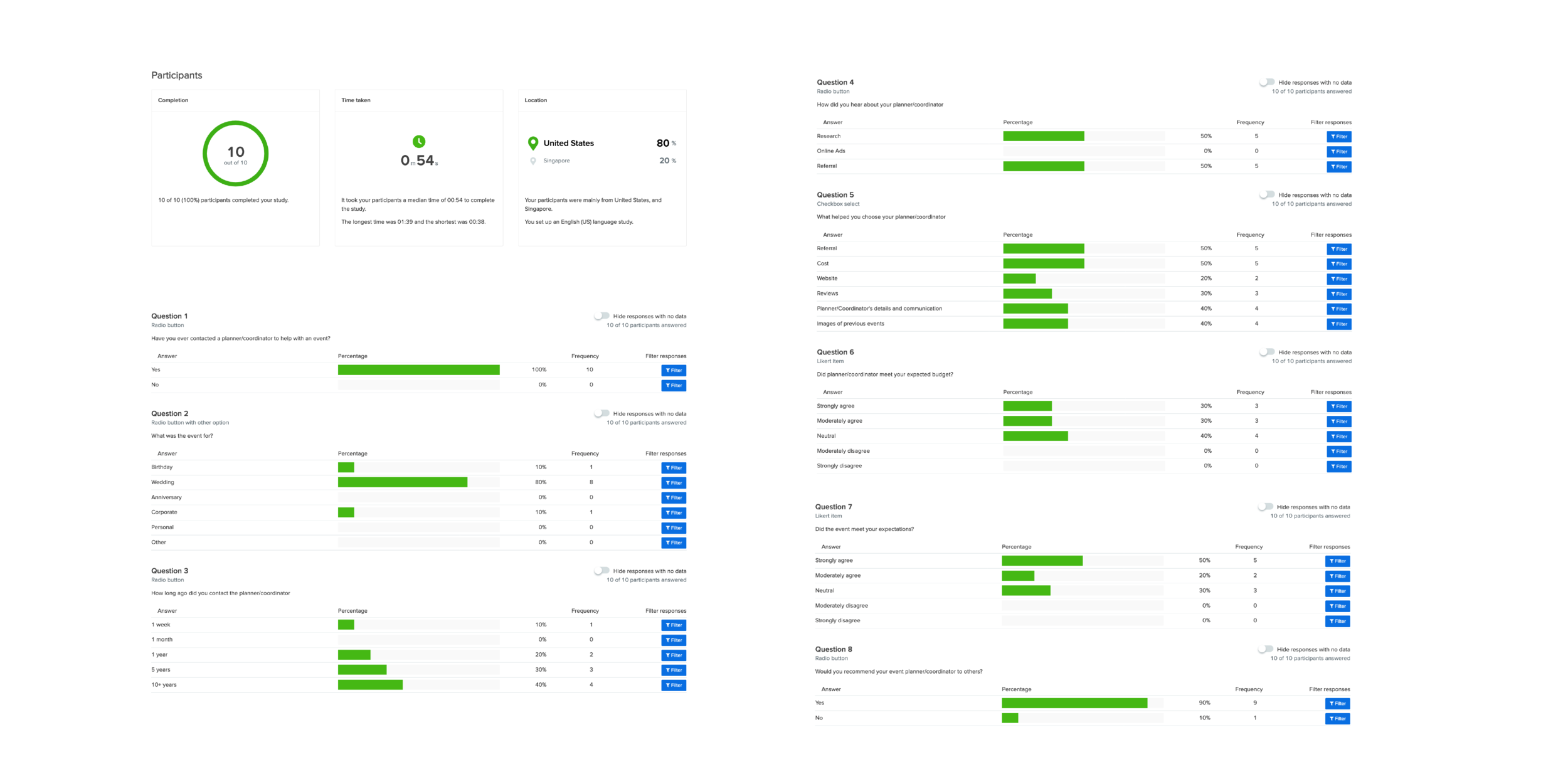
A survey was sent out to obtain feedback on their experience working with an event planner. To no surprise, 100% of the participants have worked with at least one in the last 7-10 years. Choosing a planner came down to referrals and costs.
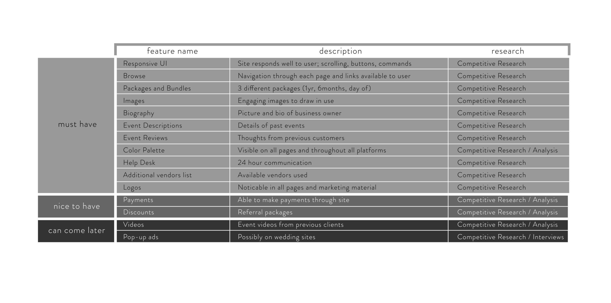
From conducting interviews, I found that majority of planners do not offer packages. This should be incorporated into T.Carcel Events for a more faster and efficient business.
INTERACTION DESIGN
UI Product Requirements
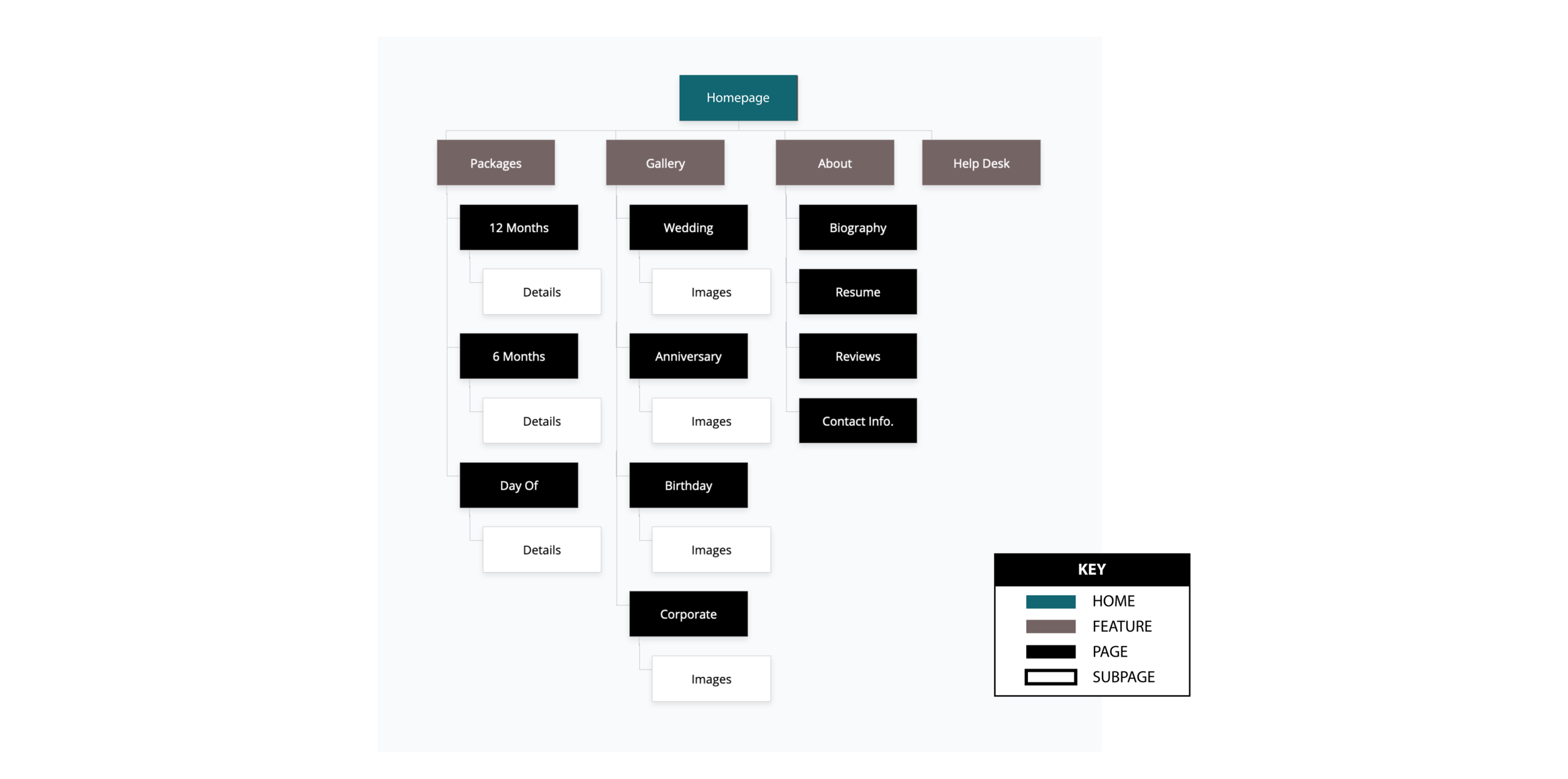
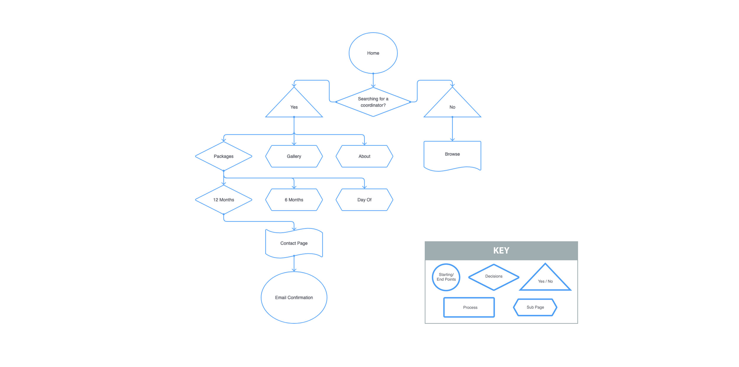
Pages to Design
Homepage: Package List, Gallery, Hero page, Introduction
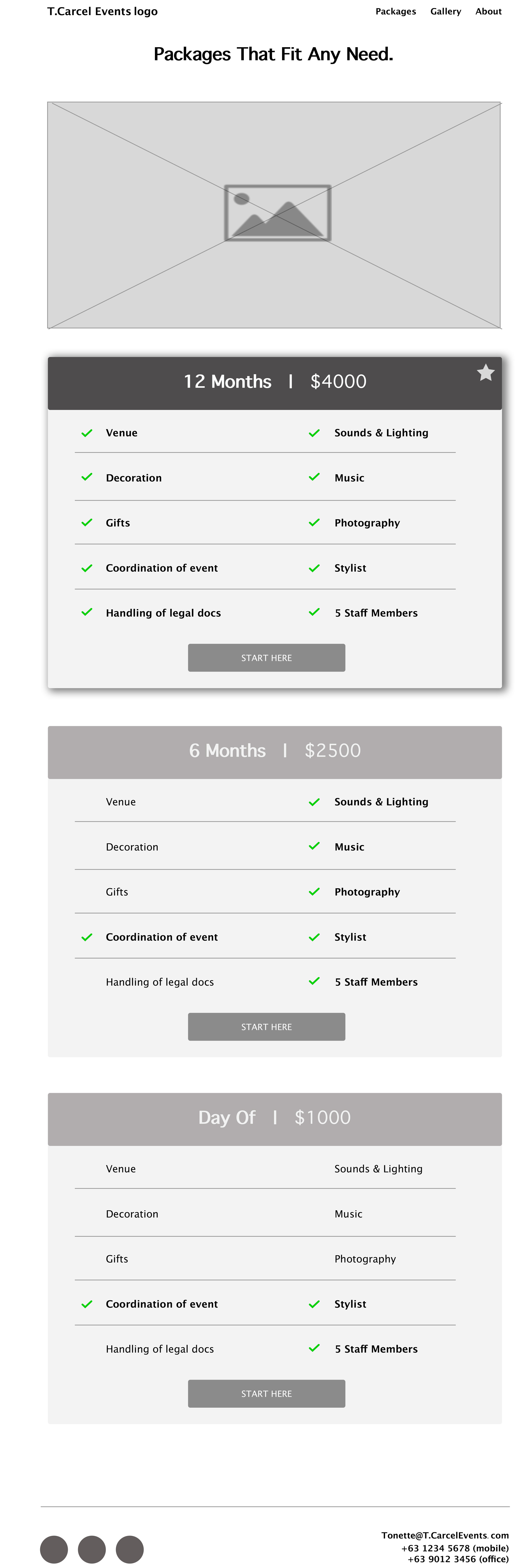
Packages page: 3 visible bundles (12 month / 6 month / Day Of)
Check Out page: Package pricing, Information and Confirmation forms
High Level Requirement
To make the user feel like they are in control with design that showcases the company’s skills and talents. Colors and images will play a big part in drawing the user in to contact the business for consultation.
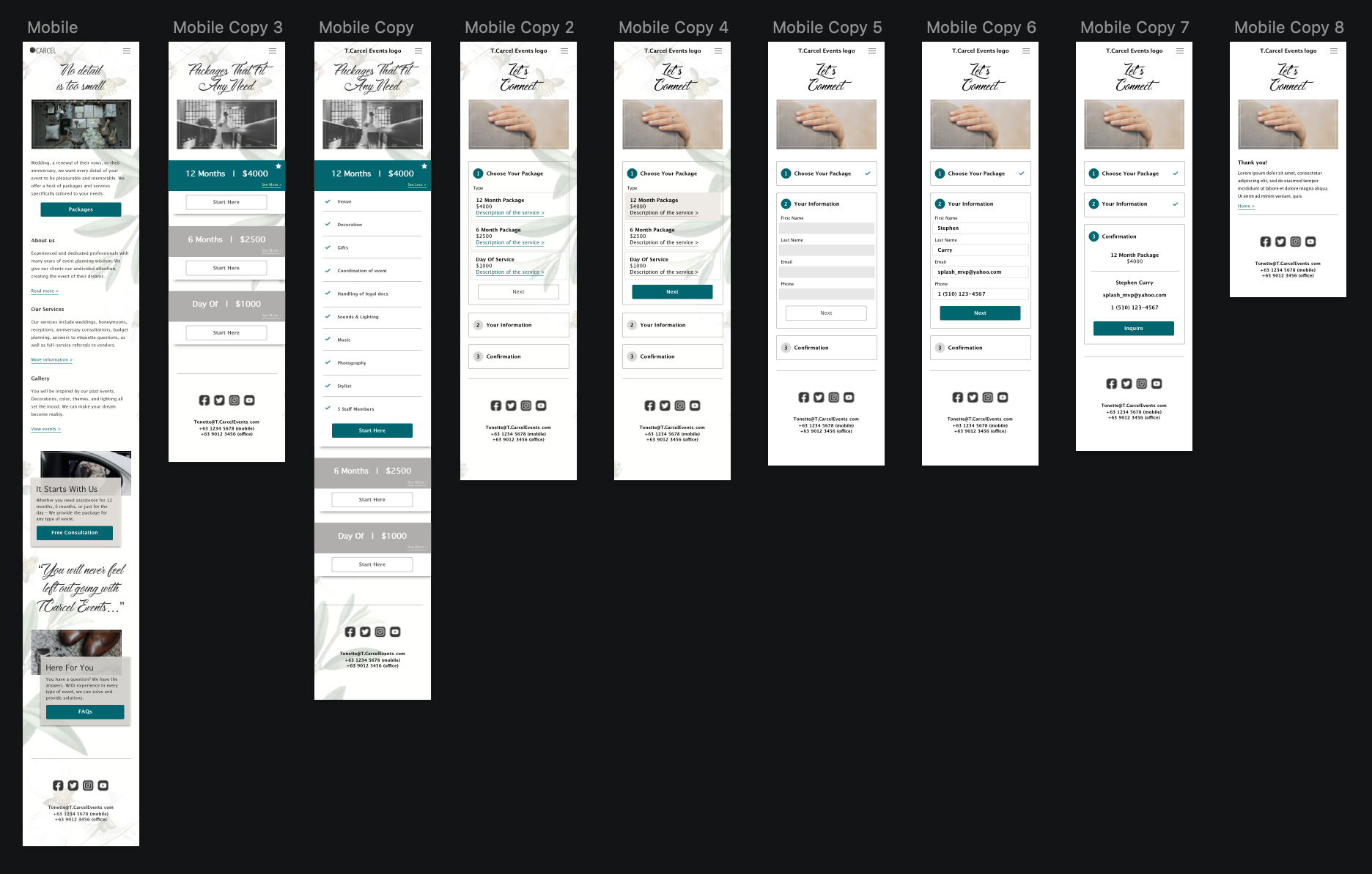
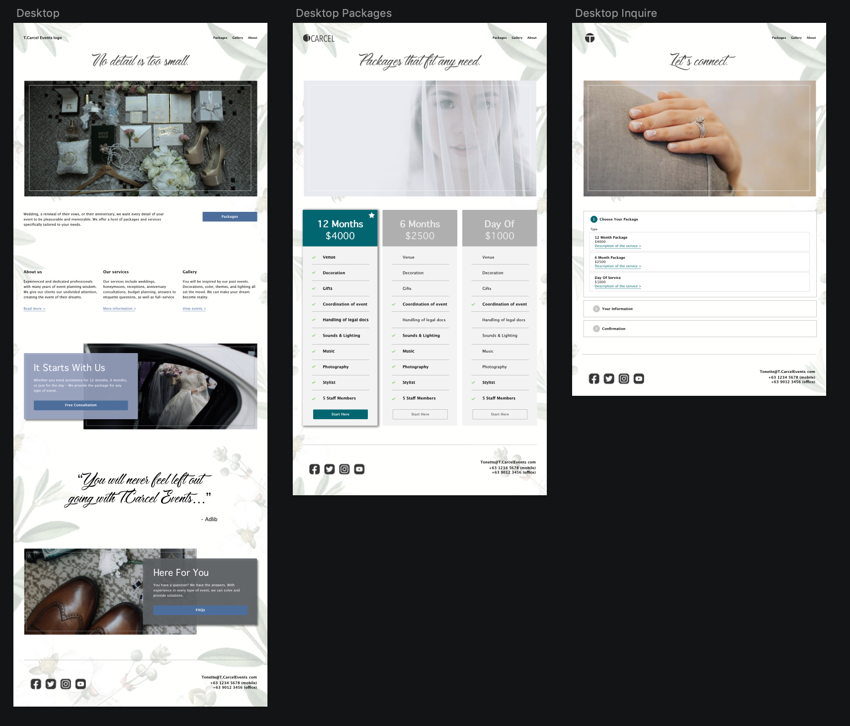
Desktop (low fidelity)


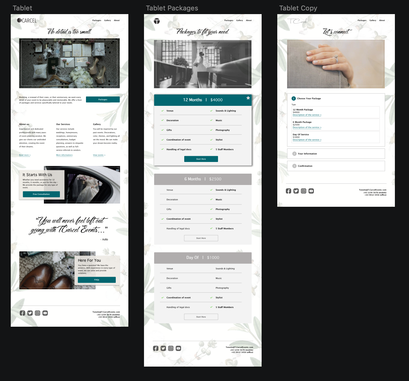
Tablet (low fidelity)


Mobile (low fidelity)


Findings
While placing my drawings in Sketch and understanding how the user will be navigating through the site, I scheduled an interview with the stakeholder. We discussed what makes her business go and what she may want to see in a potential site. She informed me that she is the only event planner in the city that has an actual office! Through my research, business owners in the city of Cebu rely on referrals to keep afloat and that websites are rarely used. Facebook is the preference.
USABILITY TESTING
Test Objectives
Does the User recognize the navigation patterns of the site
Branding communicate well to the User?
Are the buttons clear to User and what the next step should be
Typefaces selected are clear and legible to User
Clickable area for forms are easily located
Any confusing or unclear elements of design
Test Methodology
Remote testing: InVision
Subjects will receive link to UI design.
Open Ended comments
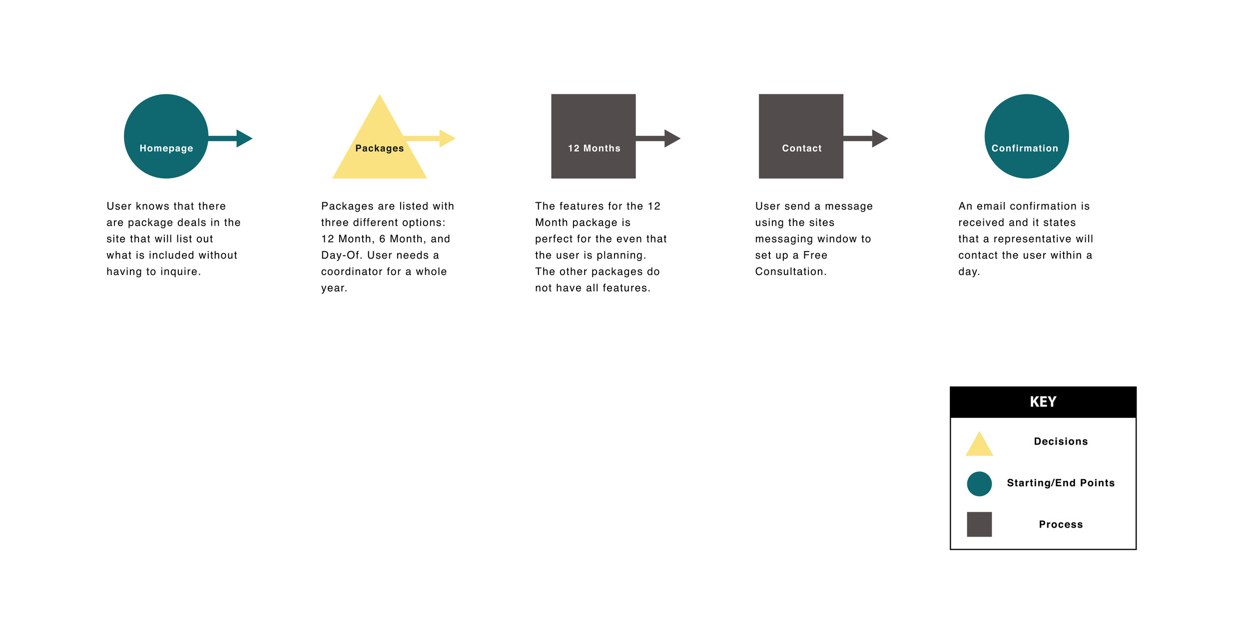
User Task
You are interested in hiring an event coordinator and searching for a package that fits your needs.
View the prototype and inquire about the company's 12-month service.
When you reach the 'Thank you' page, you have completed the task.

Goals
• Are the Users able to navigate through without confusion
• Are the buttons clear and is User able to identify them on page immediately
• How any clicks does it take for the User to reach Task goal (6 clicks)
Test Completion Rate
• Rate of completion should be 100%. Interface should feel familiar and similar to sites visited by the user.
Error Free Rate
• With limited buttons available, the User should be able to identify the task of each button by its location and how it is labeled. There should be no errors when completing the task.
Findings
Two prototypes were sent out to the same group of participants to get better answers on how well the product flows with the user.
The first was a low-fidelity prototype. The feedback I received were about the confusion of buttons and if they were active or not. Placement of text became an issue as well. Users felt that paragraphs placed next to a form disrupts the main goal.
The suggestions were noted and incorporated into the high-fidelity version. Tasks and paths to the goal became more clear.
USER INTERFACE DESIGN
UI kit

What I Learned
Event planning in the Philippines is increasing. People are willing to spend on weddings, anniversaries, and birthdays. But, what I did not expect is the amount of companies that are running their business without a website. Only using Facebook to connect with their clients. This could possibly be an advantage for the stakeholder (T.Carcel Events). To provide a site for users to view prices, video, images, and even obtain a quote immediately.
Looking back, I could have used the competitors sites as a way to receive more information from users. By viewing comments on their Facebook pages, would have provided me with more knowledge on how to approach this case study.